
As If… Night - bright
This is the start of a new series I’m doing where I look at graphic designs from the wild and redesign them “As if” I designed them myself. Not to be BETTER THAN, but rather run through the design and break them down to what I would do if I were the designer.
For the first design in this series, we’ll look at the 2026 - 45th Annual Early Iron Festival Poster.
For about 9 years 2010 - 2019 I was actually the Graphic Designer for the car club. I had resigned from the club in 2019 and hadn’t seen or been to a show until this year. I happened to be eating at a restaurant when this poster caught my eye. It was the new poster for their upcoming show. The car artwork was almost too dark to make out all of the elements. The artwork was mostly dark colors of dark reds, blues, and blacks. A few white & gray letters were the easiest to read, so it did get a message out; “45th Annual” and “Festival” then toward the bottom “Alamosa * Colorado” then, “Labor Day Weekend” and “Alamosa Colorado” again… Hmm, ok. Two Alamosa Colorado’s…
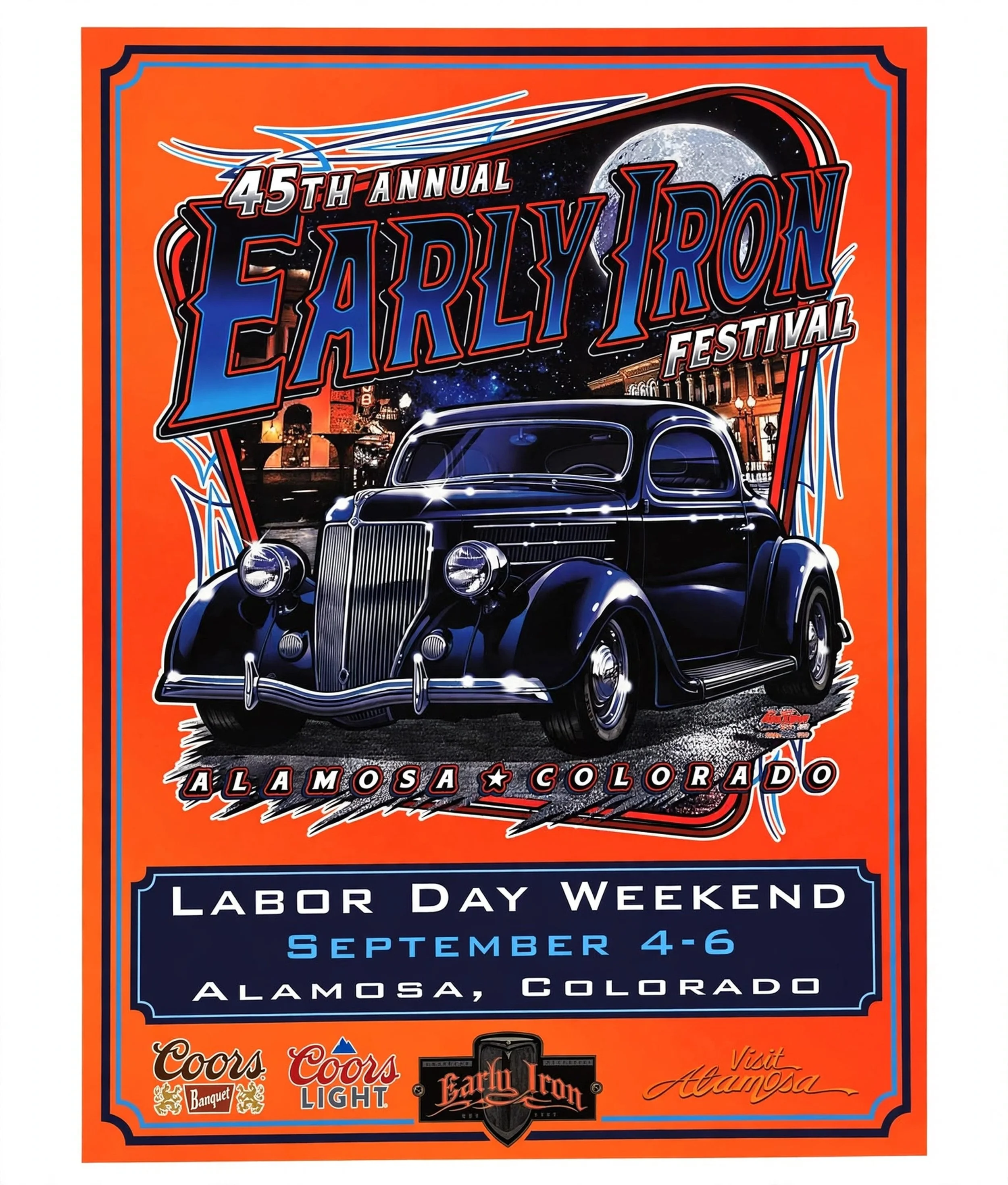
Original Poster Design by ?
In Graphic Design there are proper rules to how designs pronounce a message. You have to use hierarchy either through size, color, or both. But the message does need to be clear and unforgettable or the design fails. As we see here, the design doesn’t “fail” per say, but it fails to deliver the entire message clearly. I know it’s a festival, I know it’s their 45th, and I definitely know it’s in Alamosa, Colorado. I don’t know what else it is until I get up real close and finally make out the old car, the name “Early Iron” and find out that it is now a car show. Even though I already knew this, the rest of the audience may not.
I suppose the designer tried to make it more attention-getting by making the background orange. Right off, It knda gives me a Halloween vibe.
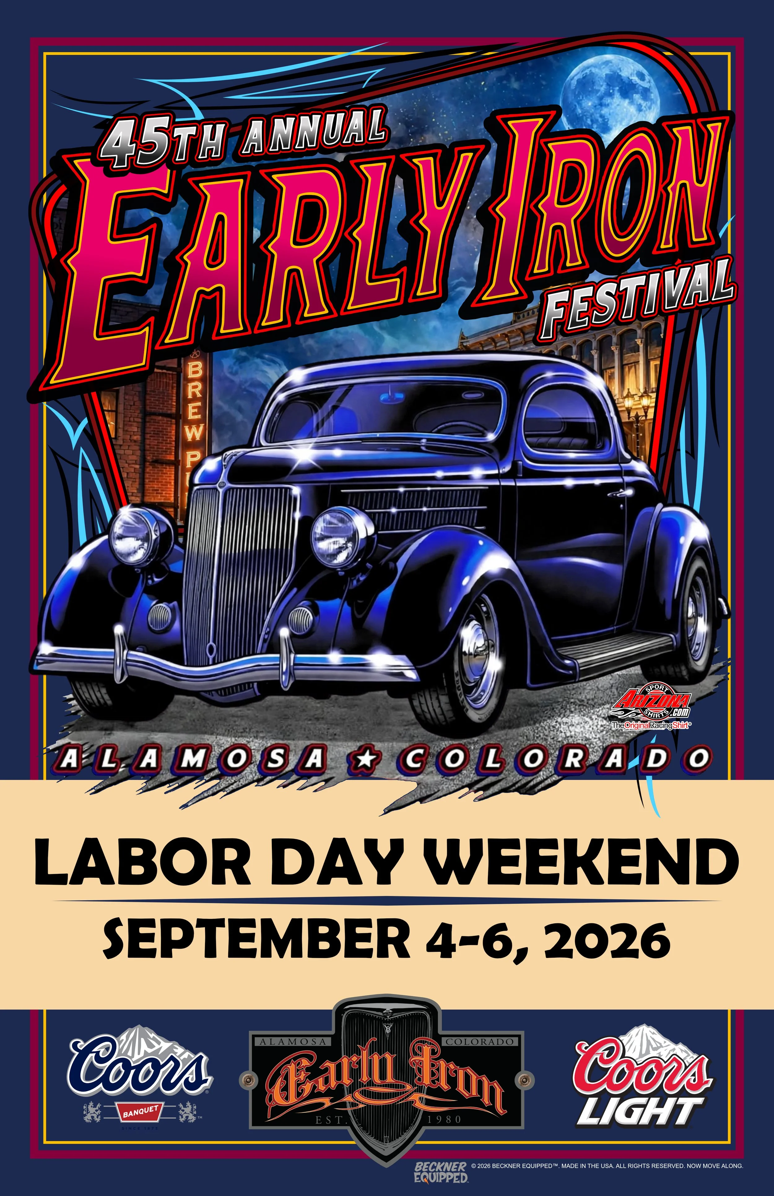
Poster design by Matt Beckner for his “As If” series of designs.
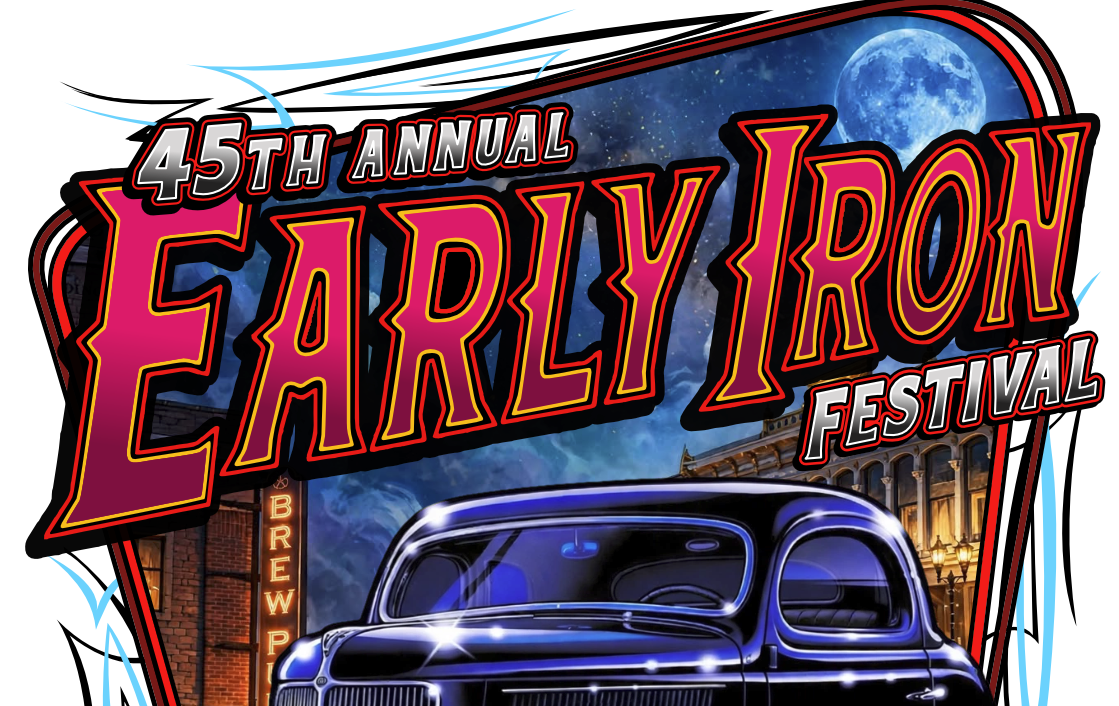
Anyways, I decided to start right at the heart of the issue. The car artwork. The car needed to quit competing with the background panel as well as the Early Iron Lettering. First, I worked on the background. The street scene background was unclear and dark. Then there was a huge moon that was bright and prominent for no reason at all. I rebuilt the background with my own images and put in a tasteful size moon. I added a little night clouds to give a bit of eeriness to the art, which also builds some contrast to boost the car and the Early Iron letters out from the dark.
Next, I turned my attention to the Lettering. I added a bit of color to pop the lettering out while also not to overpower the rest of the artwork. With a bit of colors from the neon sign in the background I get some colors that work, but also make sense with the rest of the vibe.
Now that the artwork was a bit better, I decided to start focusing of the rest of the poster. Instead of orange to compete with the rest of the art, I decided to now go a little darker to let the artwork boost. I added a couple pinstripes to weld the artwork to the rest of the poster as well as frame everything together.
Lastly, I wanted to boost the part of the message I wanted to be read first. “Labor Day Weekend - September 4-6, 2026”… You want everyone who reads this to immediately clear their schedule for what they are about to read in the rest of the design. Then you read what it is and where.
In now way do I claim to be a better designer for this job, but I do feel that with just a little bit more effort we can achieve a way better message.
I hope you learned a little bit from this, as I know I have.
-till next time!